This is the first place that I’ve ever lived in as an adult that had a bonafide pantry. My college apartment had a closet that we put a freestanding shelf in, and our rental house had a wealth of oddly proportioned cabinets, but this is the first time I’ve had a space that is specifically designated and designed for storing foods. And while it’s a far cry from the standard walk-in pantry found in many new construction homes it seemed so huge to me when we first moved in. Three years later it’s bursting at the seams.
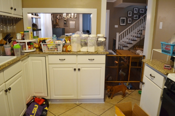
It got to the point where I really couldn’t put off cleaning and organizing it any longer. So on a bit of a whim yesterday I completely emptied the contents onto our kitchen counters. I blocked Jack out of the kitchen while I worked and he was surprisingly content to watch from the doorway.
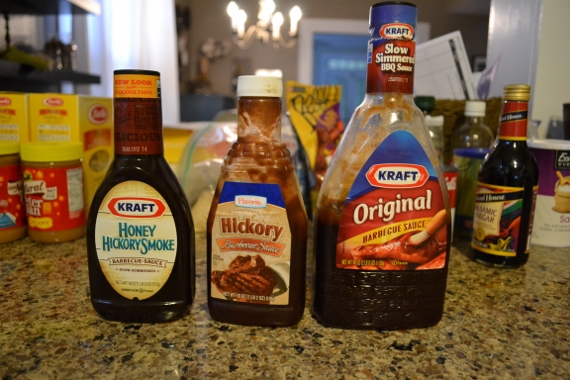
I examined and wiped down almost everything as I pulled it out. I’d set out a box for food to donate but a lot of stuff had to be tossed-like these three bottles of barbeque sauce, all expired (the two open ones were in the fridge-I was inspired to search for them when I found the unopened bottle in the pantry).
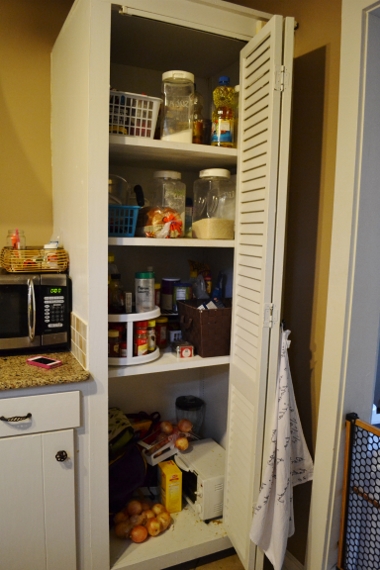
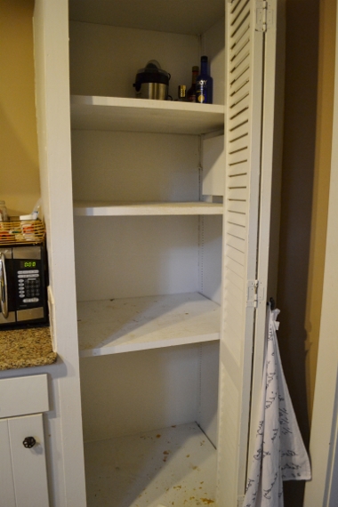
The pantry, emptied of everything except a few libations in the back and a citrus juicer that in retrospect I really should have moved out with the other small appliances. After snapping this photo I vacuumed the shelves and wiped them down.
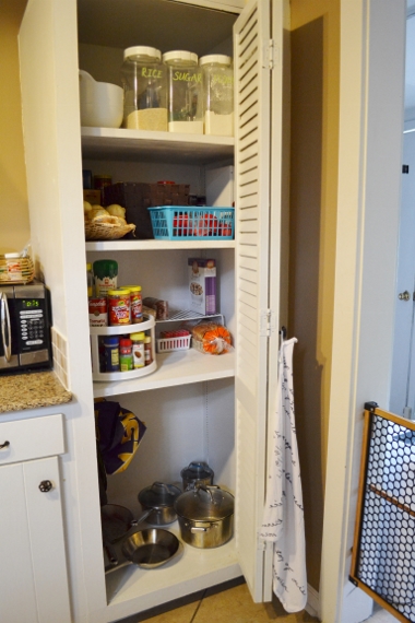
Then, ta-da! I put everything back in. Except this time I was more thoughtful about it. I actually went grocery shopping in the midst of this whole thing-there is more edible food in the pantry here than there was in the “before” photo. I can’t believe how much more functional it is.
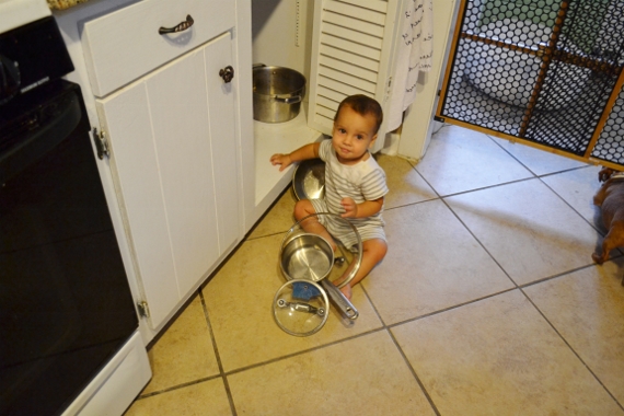
One big change for my sanity is that I removed the small appliances and random clutter that used to take up the lower area and replaced them with out most frequently used pots and pans and two command hooks to hang insulated bags we use for packed lunches, snacks for road trips, etc. Since we added childproof latches to all of our cabinets removing anything from them has become really frustrating for me so moving the pots and pans over here was a really good move. Also, I realized this was not the best place for small appliances the day I caught Jack brandishing the blade to the food processor (I hadn’t even thought about it when babyproofing!).

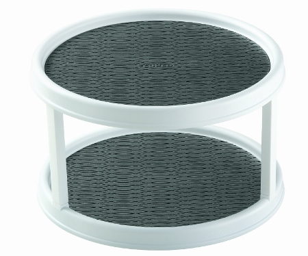
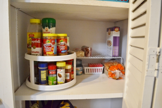
On the next shelf up, which is easiest for me to see/access and that’s all that matters because I do most of the cooking, we have a turntable with all our spices on the bottom and frequently accessed foods on the top (there’s a reason we have two jars of peanut butter: crunchy for me and creamy for Jack). On the left is more stuff we eat regularly: dry beans, cereal, cans of tuna, raisins, bread. The common denominator on this shelf is that it’s all stuff we rotate through and replace pretty frequently (with the exception of the spices, which just made sense to keep on the turntable).
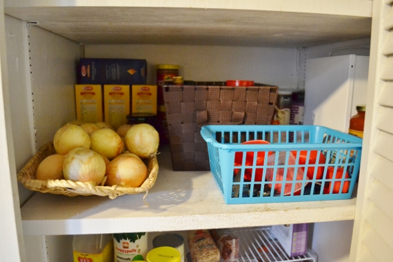
On the next shelf up is what I think of as a little mini stockroom. Since I started watching our grocery budget a little more closely a few months ago I’ve been stocking up on stuff we use when it’s on sale. But I kept running into the problem of forgetting where I’d put stuff and then buying more because I thought we were out. So now this shelf is the designated spot to put anything I’ve stocked up on or that we don’t use daily but still like to keep on hand. Examples: pasta, peanut butter, and oatmeal are all stockpiled in the back; that brown basket contains items we access infrequently like syrup, salt, pepper, vinegar, and olive oil (with the exception of syrup, we have smaller containers of all those things out in the kitchen that we just refill as needed); there are a couple of jars of pasta sauce over there on the right, that blue basket keeps all my measuring cups easily accessible, and the onions are corralled in a basket (they were on sale-buy one bag get one free-hence the large number). I made sure that the stuff we needed to access least often is way in the back where it’s hardest to get to while items we grab more often like onions, pasta, measuring cups, etc. are easier to access from the front.
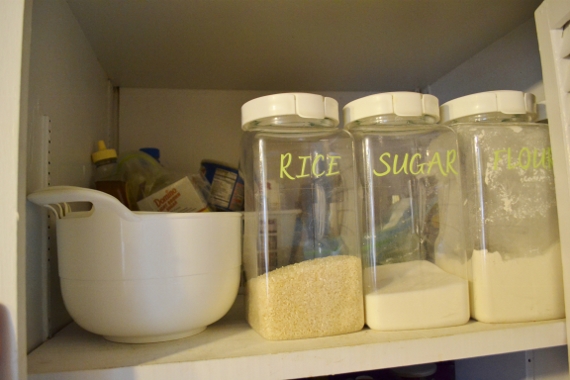
And finally, the top shelf. I’ve had these bulk containers for years-they’re just plastic snapware purchased at the grocery store that I labeled with scrapbooking letters (sealed with clear packing tape). They’re super functional and located front and center for easy access. My favorite mixing bowls are next to them and in the back I’ve got a basket of baking supplies. I bake maybe twice a year so having that same basket at the front of the shelf before was a waste of prime real estate.
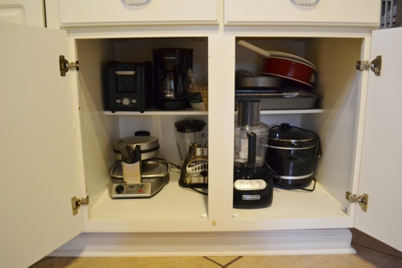
This lower cabinet on the other side of the kitchen used to house pots and pans but is now home to all of our small appliances. If we used any of these more than once or twice a month they’d probably earn a spot out on the counter, but since we don’t drink coffee and rarely toast our bread the only things we really pull out regularly are the food processor and crock pot (and okay, okay, I enjoy a homemade waffle now and then).
Jack is a big fan of the pots and pans now located where he can get them. He considers it his personal mission to pull them each out every time he’s in the kitchen. I tell ya, though, it was really nice having him out from under my feet while I was cleaning out the pantry and it’s tempting to start keeping the baby gate up in that doorway all the time. He’s not old enough to understand when I tell him something is dangerous but he’s almost tall enough to reach the stovetop. I’ve been searching for a stove guard that doesn’t have crappy reviews but maybe it would be best to just ban him from the kitchen altogether. Anyone else with a gas stove (knobs in the front, which he can reach!) and little kids have any suggestions?
Nick has been out of town since yesterday and I am oddly excited about showing him the reorganized pantry when he gets home today. Stuff like this just brings me such joy! I’m in there about a billion times a day making food for the baby who eats as much as I do so it might as well be super functional, right?